UI Editor
The UI Editor is where you design what guests see on the booth. A design is a UI project: every screen of the photo session, the blocks on each screen (buttons, text, live view, template cards, QR code) and the page settings that drive the booth, such as what starts a session and how long it lasts. Each booth runs one UI project, and events can pin their own. By the end of this page you will know the editor's layout, what each page does on the booth, and how to save and assign a project.
The UI Projects List
Pix Design > UI Editor opens the UI Projects list. Every account starts with one project, Default Layout.
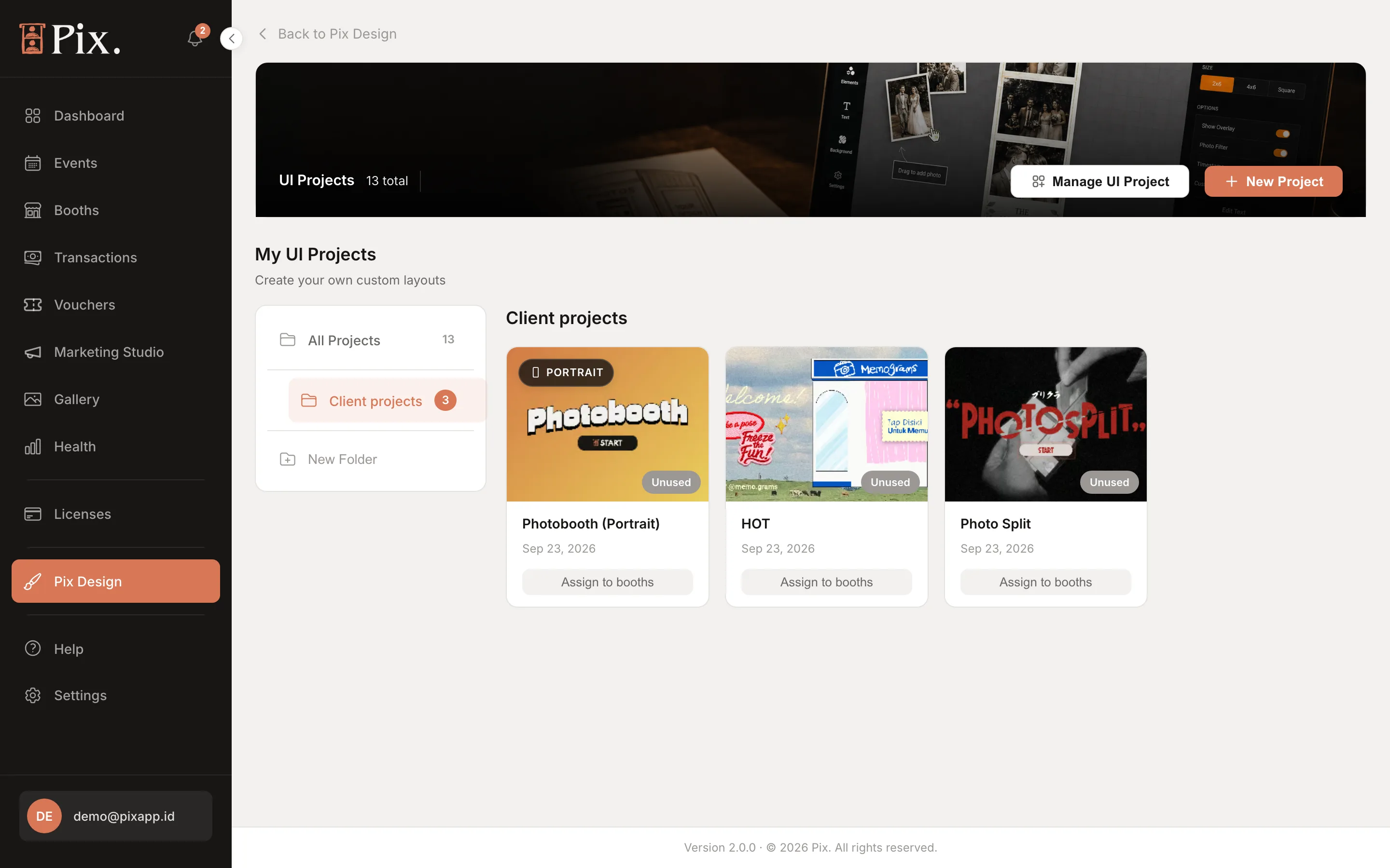
- New Project creates a project (on Pix Starter the button reads Upgrade to Create).
- Manage UI Project lists booths and jumps to a booth's UI Project tab.
- New Folder in the left column groups projects, for example by client or venue. Tick cards, or Select All, then Move to files them; All Projects always shows everything.
- The card menu offers Duplicate, Rename, Assign to booths, Add frame template to this project (attaches a print template to the project) and Delete.
On Pix Starter a banner explains that you can try the UI editor freely, but saving a project needs Pix Pro.
Creating a Project
-
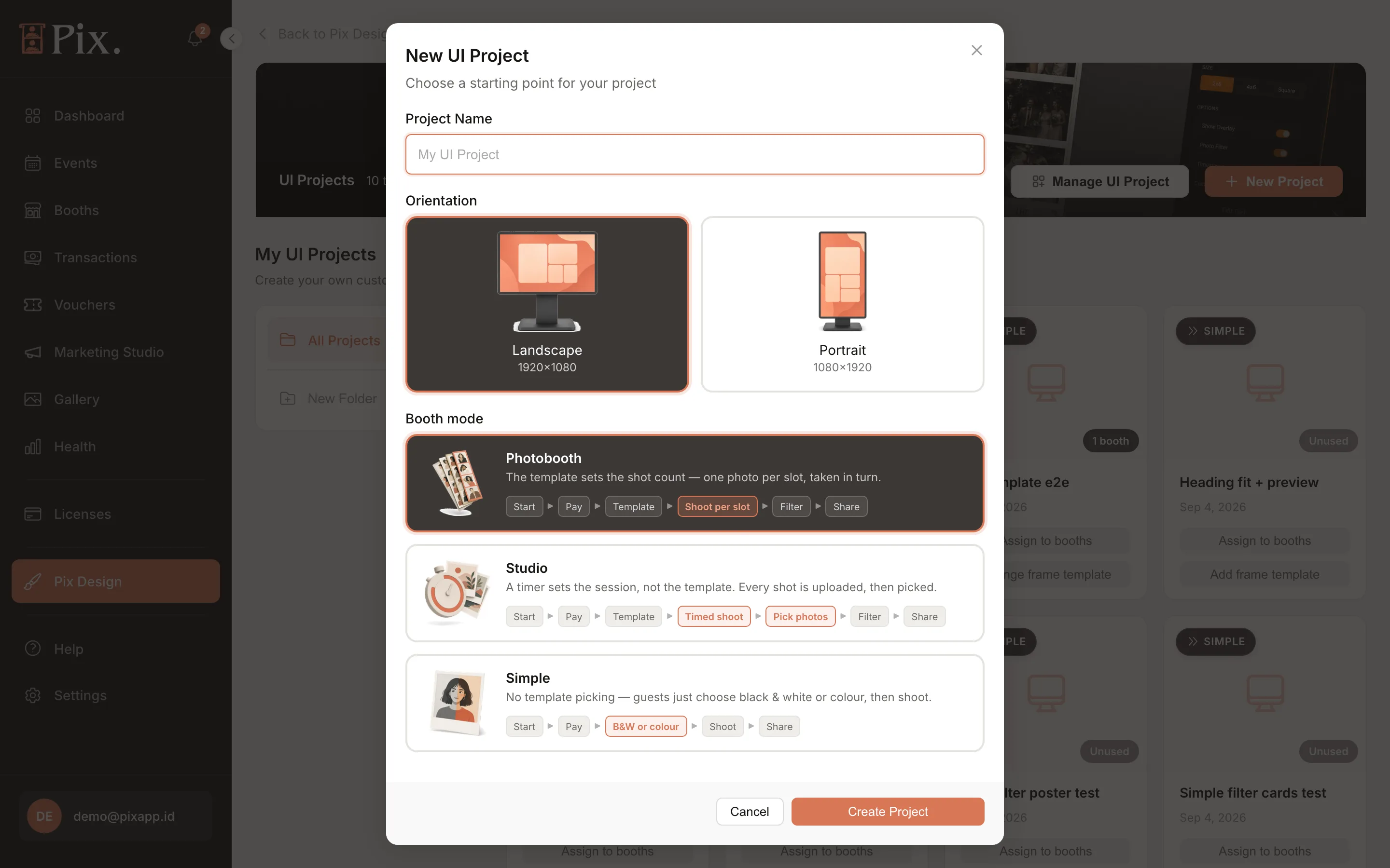
Click New Project.
-
Enter a Project Name.
-
Choose the Orientation: Landscape (1920 x 1080) or Portrait (1080 x 1920). Match the booth's screen.
-
Choose a Booth mode. It sets the pages the project has and the flow the booth runs:
Booth mode Flow on the booth Photobooth Start > Pay > Template > Shoot per slot > Filter > Share Studio Start > Pay > Template > Timed shoot > Pick photos > Filter > Share Simple Start > Pay > B&W or colour > Shoot > Share Photobooth is the classic booth: one photo per template slot. Studio lets the guest take free shots for a set time, then place the ones they like into the template; it needs Pix Desktop App 1.1.98 or newer (see Studio sessions). Simple is a colour choice and a shot.
-
Create the project. It opens in the editor.
Editor Anatomy
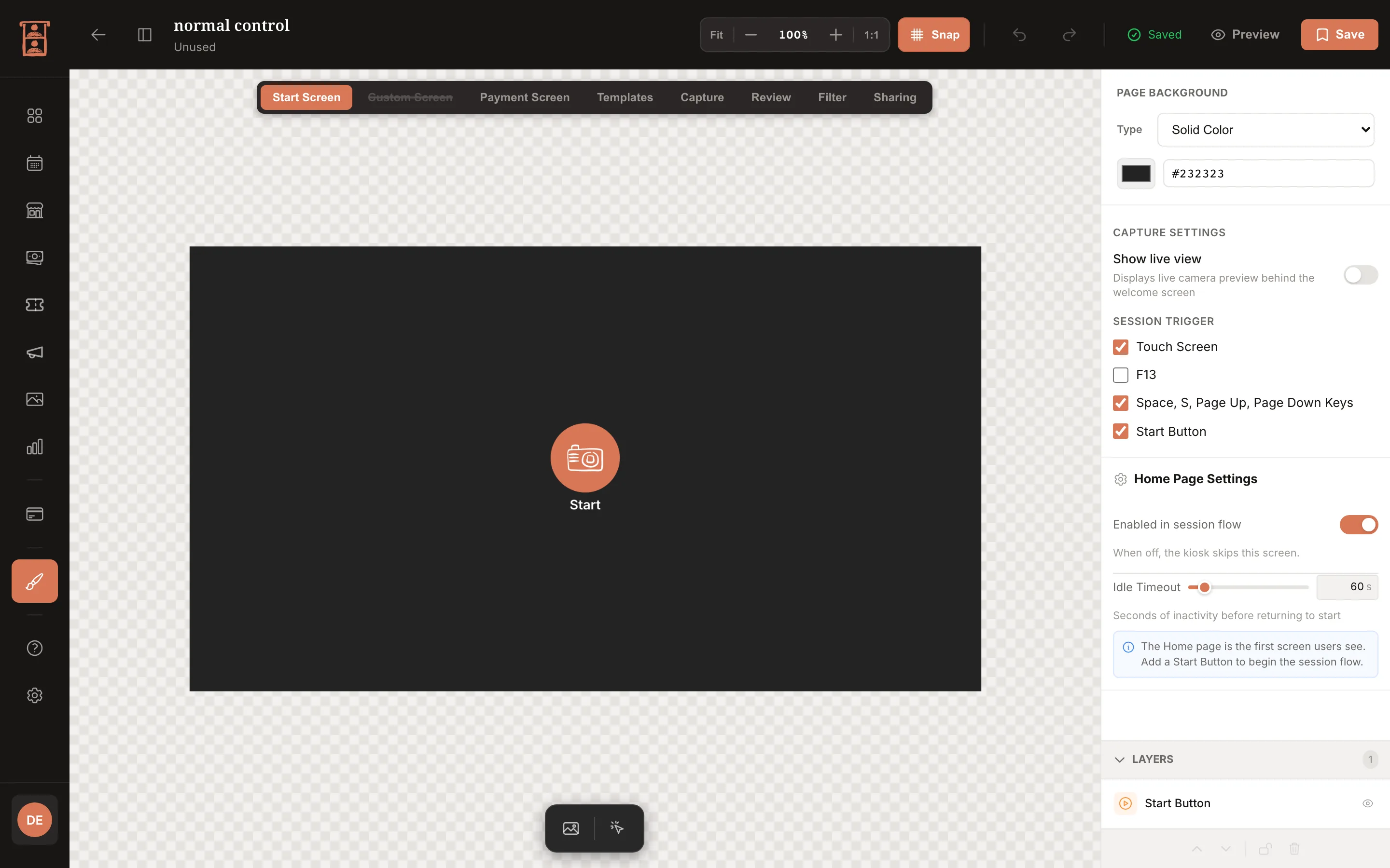
- Header. The project name and where it is used ("Unused" or "N booths").
- Page tabs. Start Screen, Custom Screen, Payment Screen, Templates, Capture, Review, Filter, Sharing. Studio projects add Assign photos.
- Toolbar. Fit, zoom and 1:1; Snap; undo and redo; a "Saved" state; Preview; Save.
- Canvas. The screen at booth resolution. Drag a block to move it, drag its corners to resize it.
- Block palette. A floating bar at the bottom of the canvas adds blocks to the current page.
- Right rail. Page Background first (Type: Solid Color, Image, Gradient, or Video on the Start Screen only), then the page's own settings, then the selected block's properties.
- Layers. The stacking order of the page's blocks, at the bottom of the rail.
Pages have an Enabled in session flow checkbox in their settings: "When off, the kiosk skips this screen." This is how you drop the tutorial, run free sessions without a Payment screen, or send photos out unfiltered.
The Pages
Start Screen
The idle screen guests walk up to. Its settings:
- Show live view under Capture Settings puts the camera feed on the idle screen.
- Session Trigger checkboxes decide what starts a session: Touch Screen, F13 (a coin or card system's paid signal), Space, S, Page Up, Page Down Keys (a clicker or foot switch) and Start Button (the on-screen button block).
- Enabled in session flow, and Idle Timeout: the seconds before the booth returns to this screen.
Custom Screen
An optional tutorial or intro screen between Start and Payment. Turn on Enabled in session flow to use it.
Payment Screen
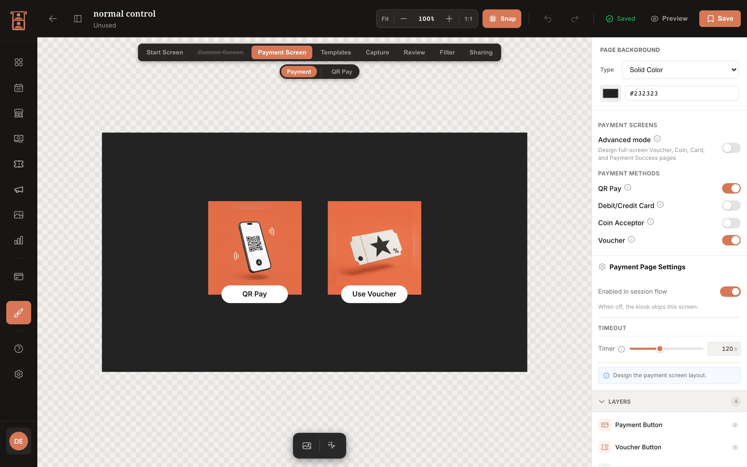
Where guests pay before choosing a template. Prices come from the booth's Pricing tab; the editor decides how the screen looks and behaves.
- The main page shows the packages and the payment methods. Each method has its own sub-screen: voucher, coins, card and success. Turn a method on and its sub-screen tab appears; a click area wired to a method counts as turning it on.
- Payment blocks: Payment QR (the QR code the guest scans; its popup takes your colours, fonts and buttons), Voucher Input (a ready-made card with an editable title, subtitle and button), Voucher Field (only the code box, for your own artwork; Enter or your own button redeems) and Payment Status.
- Timeout: after 120 s idle on Payment the booth returns to Start (0 = never); on the voucher, coin or card step it returns to the methods after 60 s; the success screen dwells 3 s (0 = wait for a tap), and tapping any empty area continues.
- Every paid route ends on the success screen, including a voucher that covers the whole price. A free session skips Payment entirely.
On a Pix Starter computer the Payment screen is forced off, and turning Payment on this booth off on the Pricing tab skips it as well.
Templates
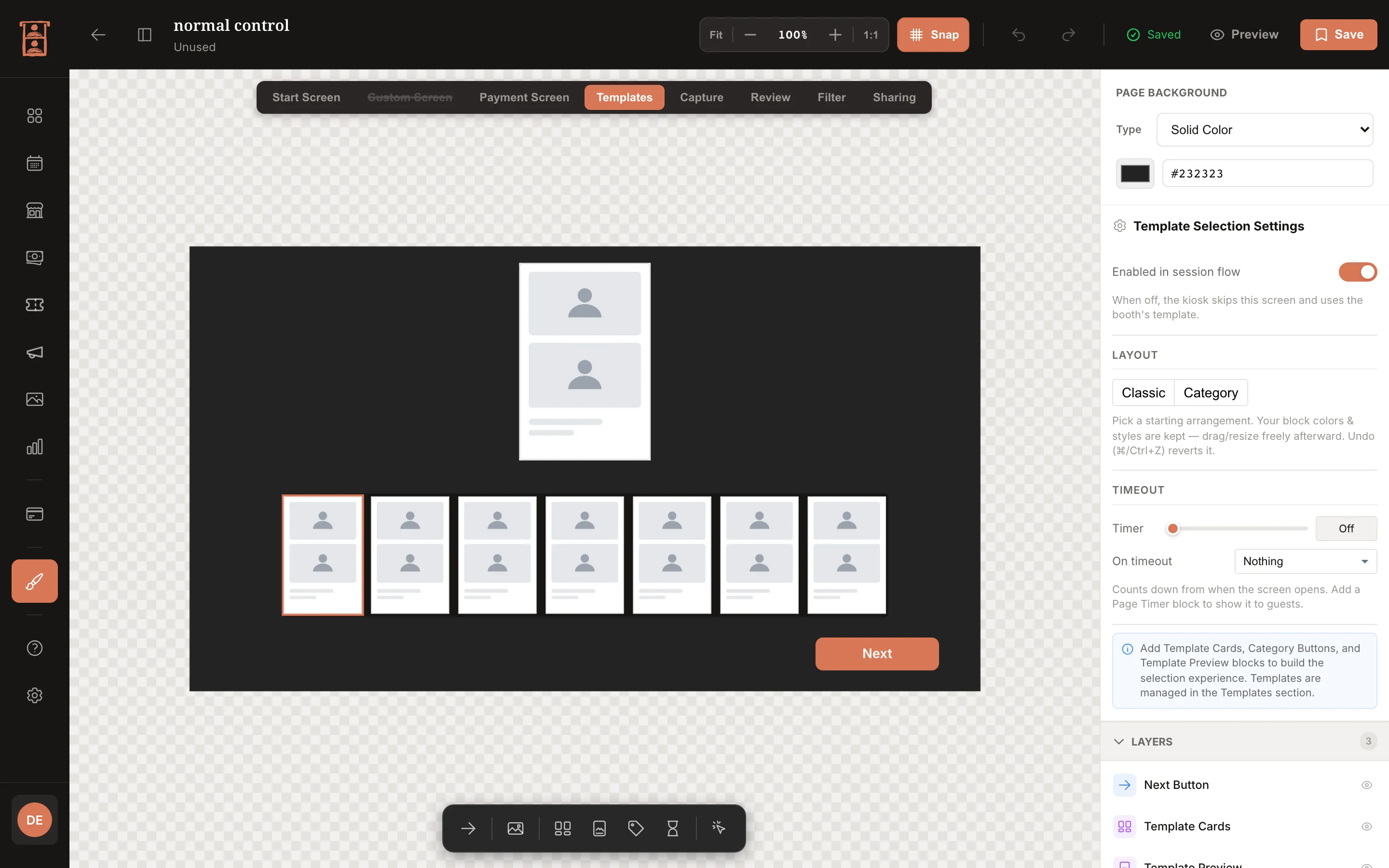
The template picker. The Template Cards block is a grid you shape with a card scale, rows and columns, a scroll direction, and an optional scrollbar with its own width, padding and colours; dragging a corner of the block scales the cards. Category buttons above the grid come from your templates' categories (see Folders and Categories), and each card shows the thumbnail rendered by the template editor. A page timer can send an undecided guest back to Start.
Capture
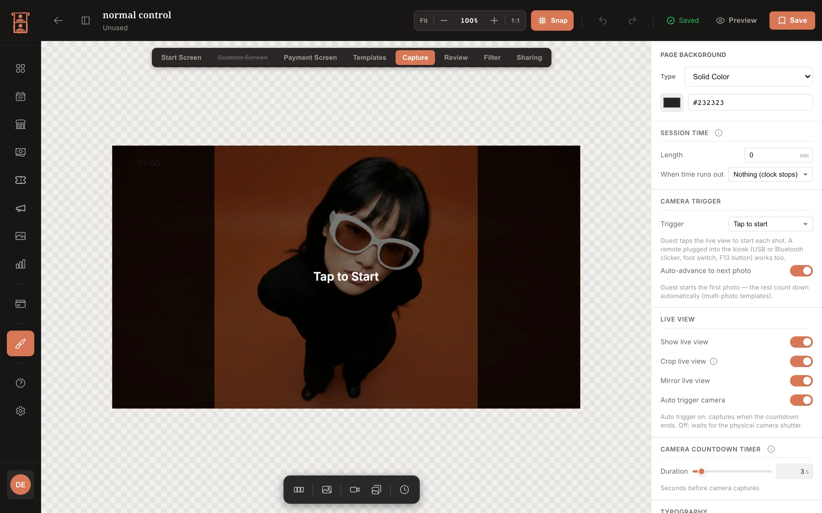
The shooting screen, and the page whose settings change the booth's behaviour most.
- Live View shows the camera. Pick a Camera Frame ratio (16:9, 9:16, 4:3, 3:4, 3:2, 2:3 or 1:1) and the booth fits the whole camera frame inside the block without cropping. Its text overlay can run to several lines, each with its own font, size, weight and colour.
- Camera trigger: Tap (the guest taps the screen), Shutter button (an on-screen button), Camera shutter (the photographer presses the camera's own shutter) or Auto (Photobooth projects only; every slot shoots on the countdown). With Tap or Shutter button the guest triggers the first photo and the booth runs the remaining slots by itself.
- The countdown before each shot.
- Session Time: the length of the session from the first capture, and what happens when it runs out. It runs whether or not you place a Session Timer block; the block only displays it. A Photo Counter block shows "n of N".
- Preview Cards: one square card per template slot, numbered while empty, filled as shots land, the current slot ringed; the row scrolls on templates with many slots.
A remote plugged into the booth follows the Start Screen's session triggers: Space, S, Page Up, Page Down or F13 take the shot.
Review
After each shot the guest checks the photo with Retake and Next; with nothing tapped the booth advances by itself. Switches let you hide the Retake button and the photo counter, and Retake disappears once the session time is up.
Review Settings > Advanced mode turns the fixed layout into a full canvas of your own: a Review Photo block, Retake and Next buttons or click areas, a counter, images and text, on a background of its own.
Assign photos (Studio only)
The screen where a Studio guest places pool shots into the template: a Template Slots block and a Photo Pool block that shares the Filter Strip's grid options. Highlight options set the ring on the selected slot, the outline on the selected photo, how used photos dim, and the slot-number badges. The guest taps a slot, then a photo; Take more returns to Capture with the pool kept. A Studio session ends on its session length, its photo limit (up to 40 shots) or Done, which appears once every slot can be filled.
Filter
The Filter Strip block lists the booth's filters with the same grid options as Template Cards, plus a card ratio from 16:9 to 1:1 (square by default). The Filter Preview block shows the guest's photo with the chosen filter and has its own Camera Frame ratio. Which filters appear is set on the booth's Filters tab; see Photo Filters and Overlays.
Sharing
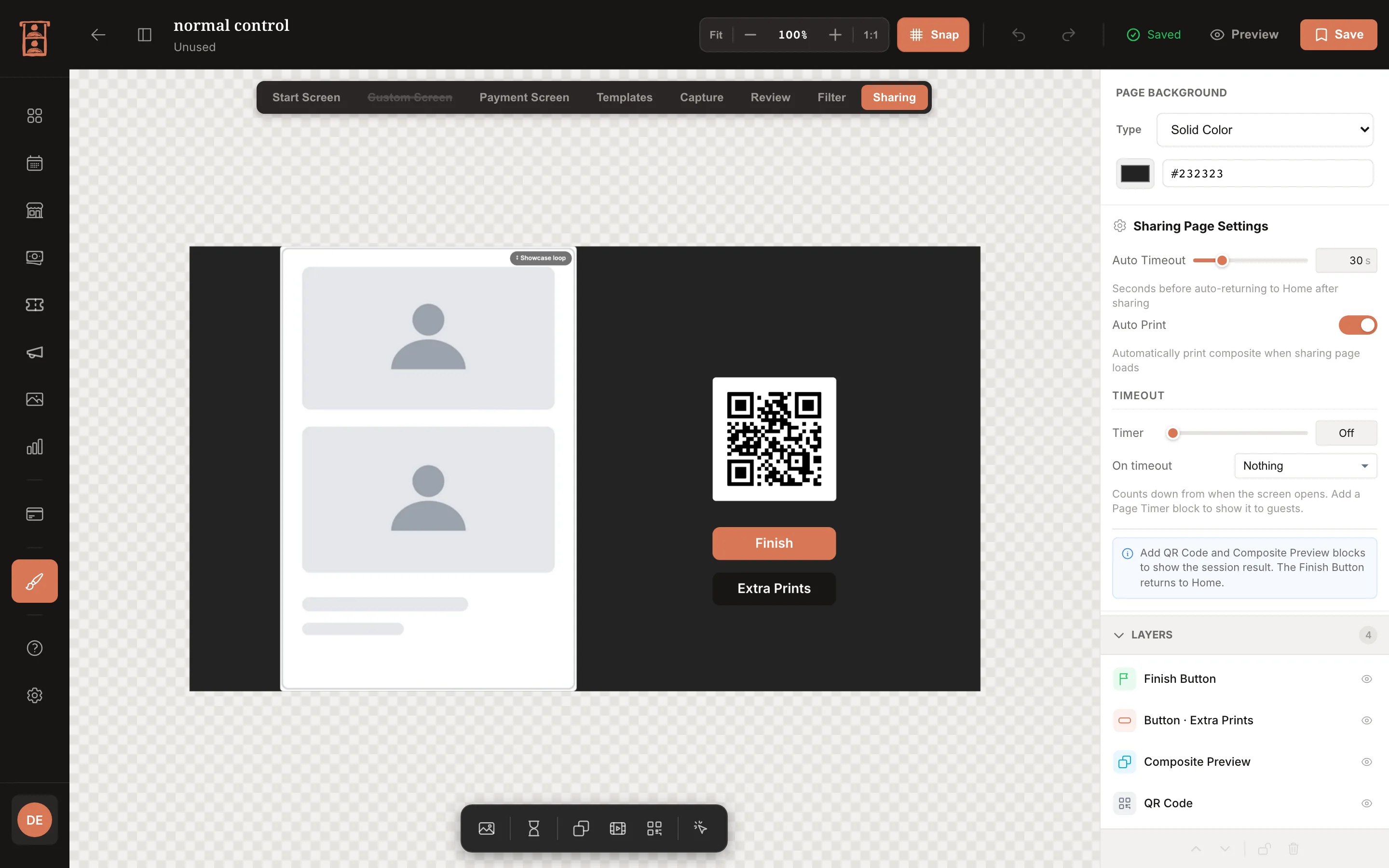
The last screen: QR code, print, and back to Start.
- The composite preview has a Showcase loop switch. On, it loops through the session's outputs; off, it shows the composite and then the live photo once ready.
- The QR Code block links to the guest's share page. See Microsite (Share Page).
- Finish ends the session; the page timer returns to Start if the guest walks away.
- Extra prints are sold here when Extra print price (sharing screen) is on in Booth Pricing; the print mockup follows the booth's print format.
- The GIF and live photo previews show the real files once encoded.
Working With Blocks
Every block has a position and size, a corner radius (0 by default), and, where it draws text, a font, size, weight and colour. Buttons and click areas carry an action such as start, next, retake, apply voucher or finish, so you can build a screen entirely from your own artwork and invisible click areas. To change a number quickly, drag its label in the properties panel left or right.
Preview
Preview runs the current page the way the booth will, with sample photos and mock payment blocks, so you can check the flow and the touch targets before saving. Test on the real screen once: targets that look fine on a laptop can be small on a 24-inch display.
Saving and Publishing
Save publishes the design and the toolbar shows "Saved". Booths running the project pick up the design on their next idle refresh, usually within seconds, without a restart; a photo session in progress finishes on the old design. On Pix Starter every tool works, but Save needs Pix Pro (see Pix Design Overview).
Assigning to Booths
Three places:
-
Assign to booths on the project's card menu: tick booths or All booths, then Apply.
-
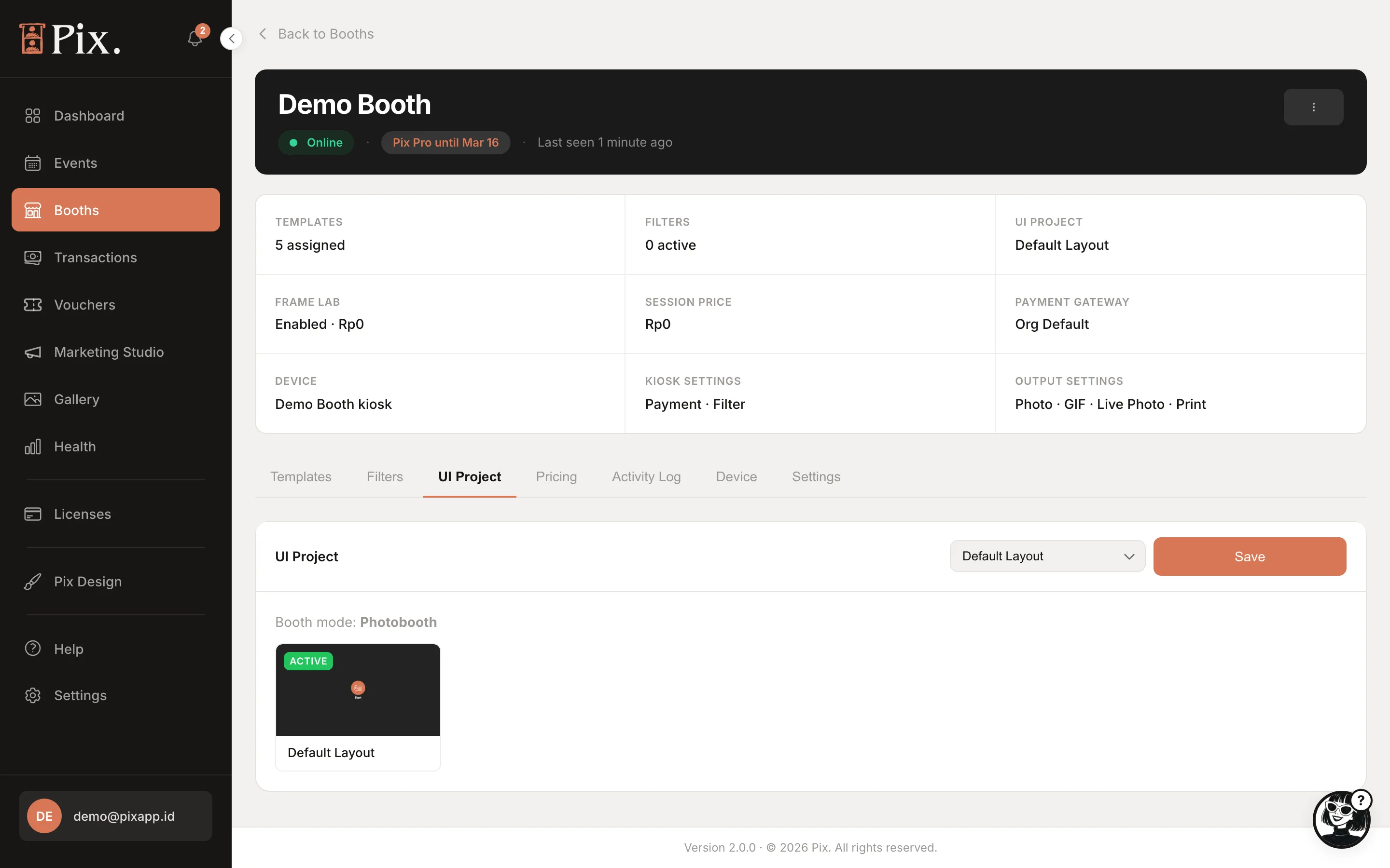
Booths > booth > UI Project tab: the dropdown groups projects under Photobooth mode, Studio mode and Simple mode. Pick one and click Save. The tab warns when Studio needs a newer app.
-
Events > event > Setup > Appearance > Change: pin a UI project to the event. The list shows only projects made for the event's booth mode. While the event runs, its choice wins.