Customise the Booth Screens
In this tutorial you will create a UI project in Pix Design, design the Start, Payment, Templates, Capture, Review, Filter and Sharing screens, preview and save the design, and assign it to a booth. Allow about 45 minutes for a first design.
Before You Start
- Pix Pro or the free trial. Pix Starter can open the UI Editor and try everything, but creating a project or saving needs Pix Pro.
- Your artwork ready: a background image (or a video for the Start Screen) in the orientation of your booth screen, plus a logo if you want one.
- Know your booth screen's orientation: Landscape (1920 x 1080) or Portrait (1080 x 1920).
Step 1: Create the UI project
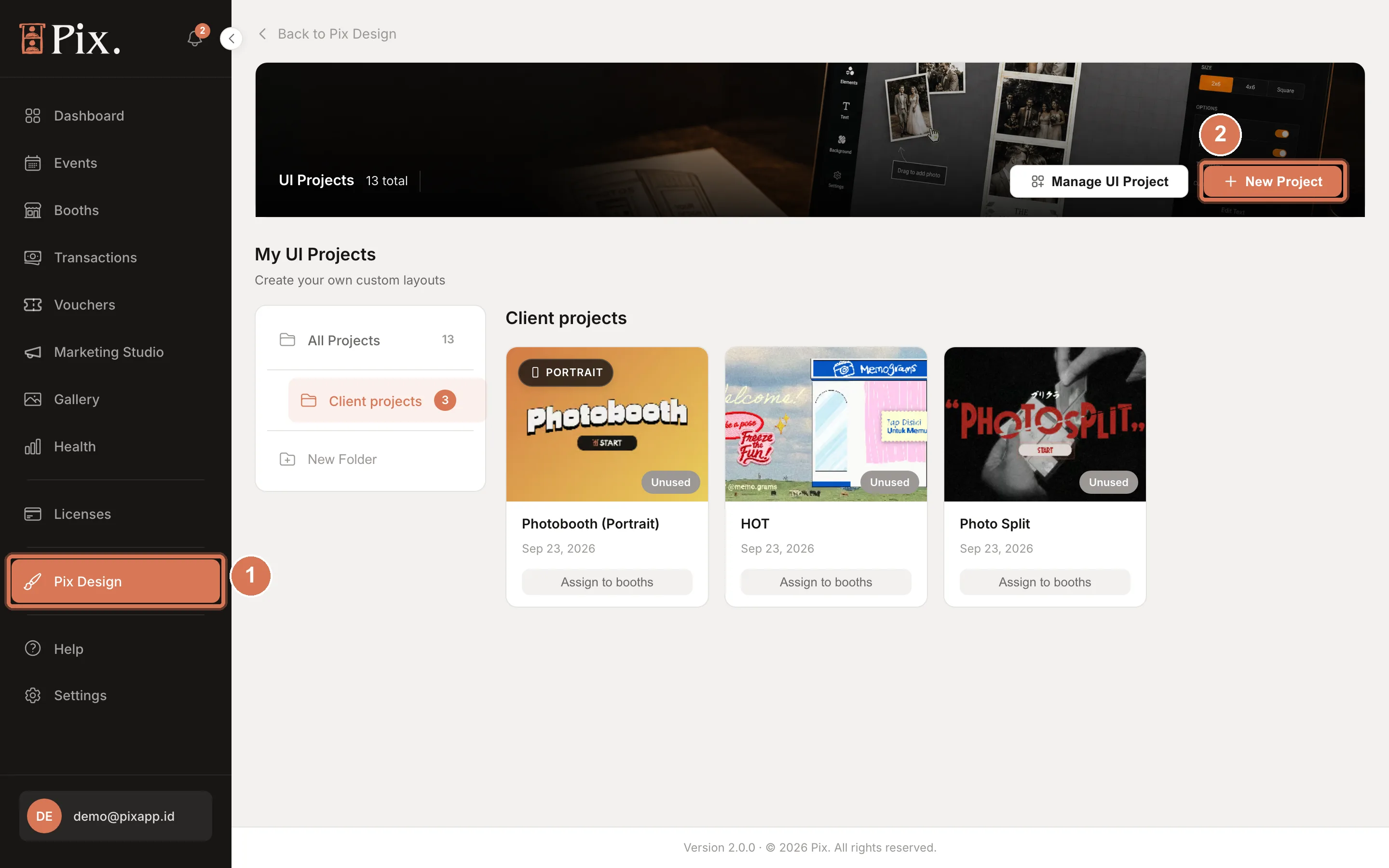
- Click Pix Design in the sidebar, then open UI Editor.
- On UI Projects, click New Project.
- Type a Project Name, pick the Orientation (Landscape 1920×1080 or Portrait 1080×1920) and a Booth mode, then create the project.
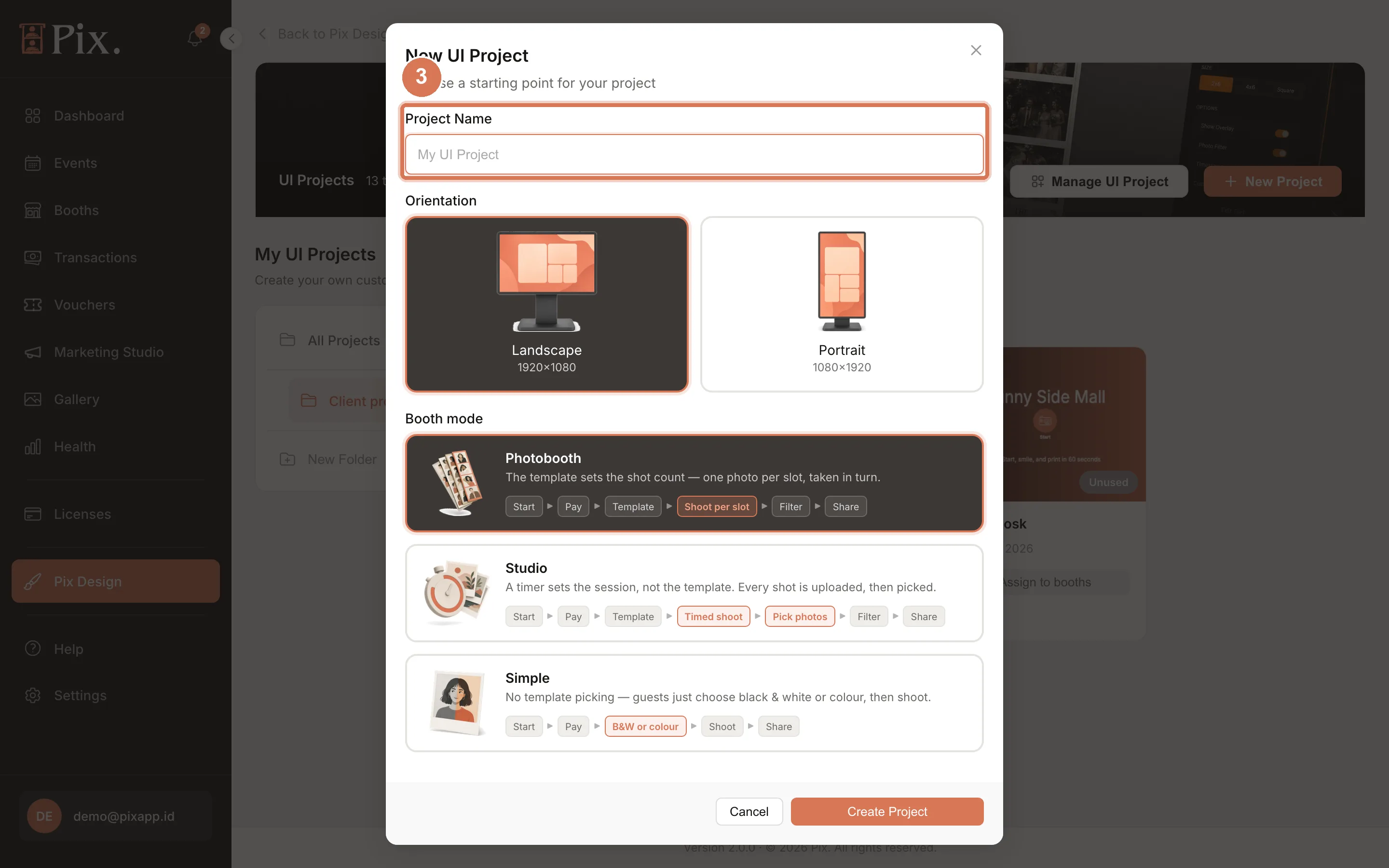
Booth mode sets the flow the design follows:
| Booth mode | Flow |
|---|---|
| Photobooth | Start, Pay, Template, Shoot per slot, Filter, Share |
| Studio | Start, Pay, Template, Timed shoot, Pick photos, Filter, Share |
| Simple | Start, Pay, B&W or colour, Shoot, Share |
Studio mode needs Pix Desktop App 1.1.98 or newer on the booth. See Studio Sessions.
Step 2: Find your way around the editor
- Page tabs across the top: Start Screen, Custom Screen, Payment Screen, Templates, Capture, Review, Filter and Sharing (a Studio project adds Assign photos). Each tab is one booth screen. Custom Screen is an optional extra page; include it with Enabled in session flow.
- Canvas in the middle, with Fit, zoom and 1:1 controls, Snap for alignment, undo and redo.
- Floating palette at the bottom of the canvas adds blocks: Text, Image, Start Button, Next Button, Live View, Template Cards, Preview Cards, QR Code, Session Timer, Filter Strip and more.
- Right rail: PAGE BACKGROUND first (Type: Solid Color, Image, Gradient, or Video on the Start Screen), then the page's own settings, then the settings of the selected block.
- LAYERS at the bottom of the rail lists the blocks on the page.
- The header shows the project name and where it is used (Unused or N booths). Preview shows the design as the booth will; Save stores it, and the toolbar reads Saved when nothing is pending.
Step 3: Design the Start Screen
- On the Start Screen tab, set PAGE BACKGROUND > Type to Image and upload your artwork, or Video for a looping clip. Solid Color and Gradient work too.
- Under SESSION TRIGGER, tick how a session starts: Touch Screen (tap anywhere), Start Button (adds a button block you can style), F13 (for a cash system or a remote button) and Space, S, Page Up, Page Down Keys.
- Under Home Page Settings, keep Enabled in session flow on and set the Idle Timeout, the number of seconds before the booth returns to the start.
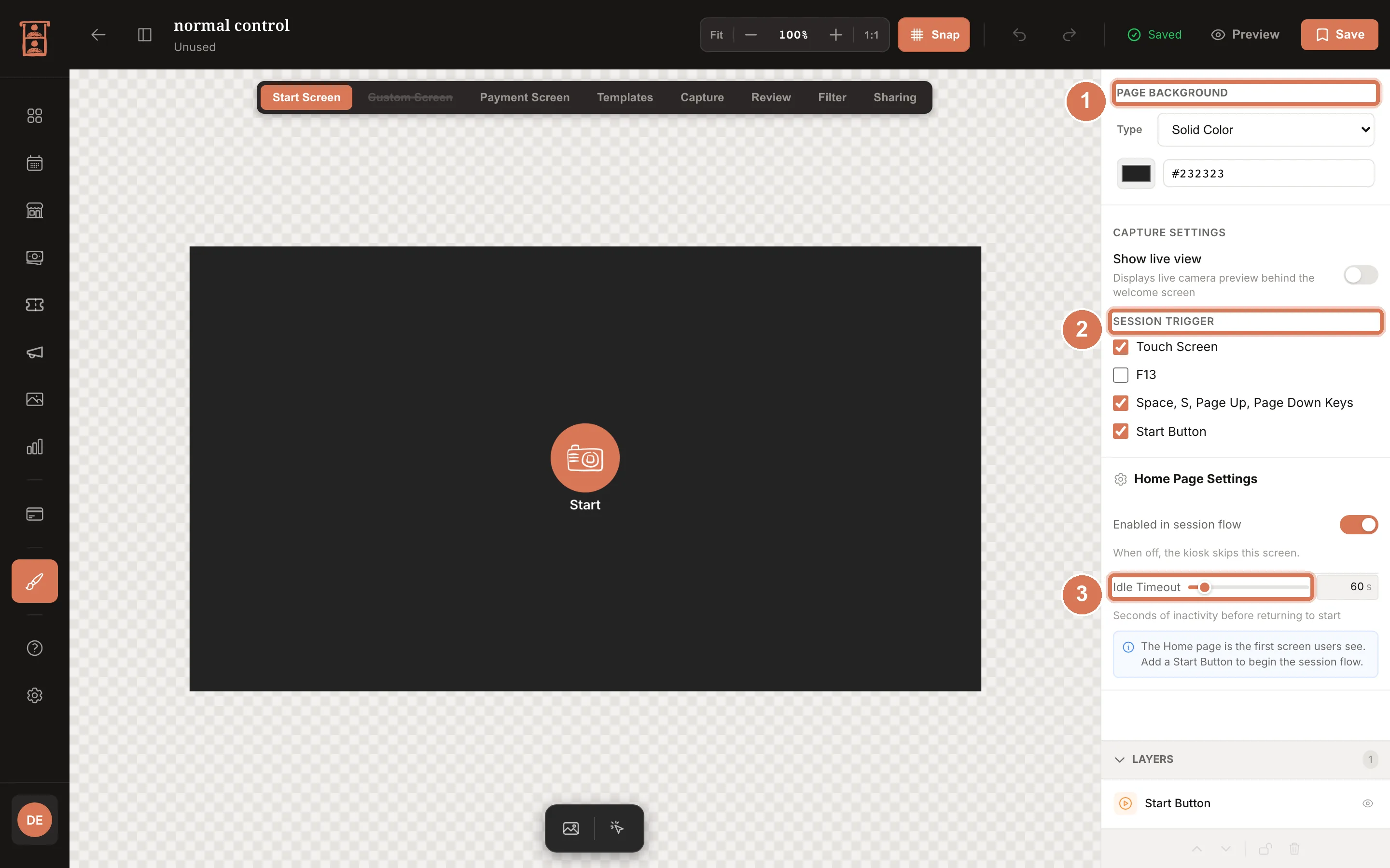
CAPTURE SETTINGS > Show live view puts the camera feed on the Start Screen, so passers-by see themselves. Every page has Enabled in session flow; when it is off, the booth skips that screen.
Step 4: Design the Payment Screen
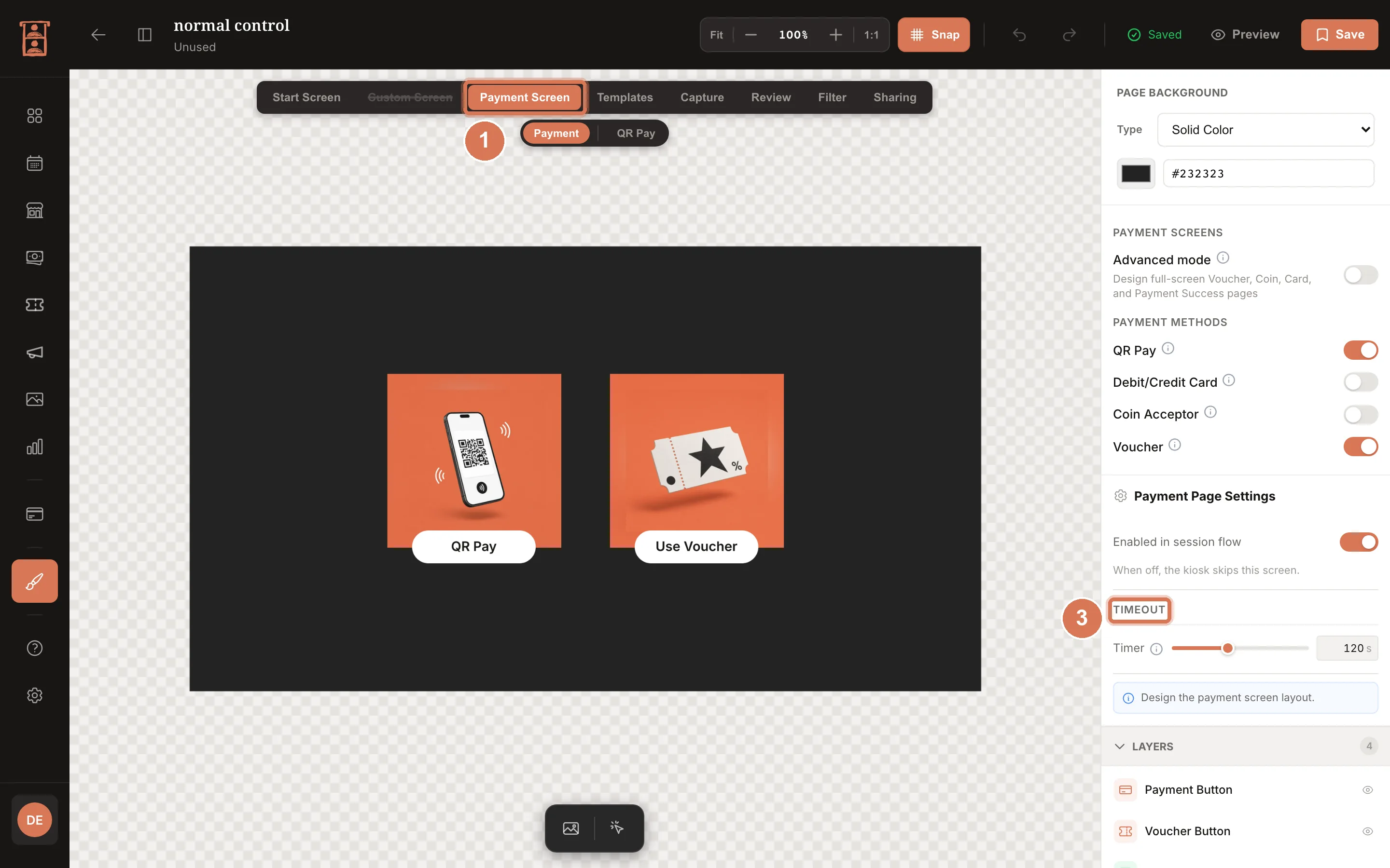
- Open the Payment Screen tab. Besides the main screen with the QR payment, it has sub-screens for voucher, coins, card and success. Design the ones your guests will meet; a sub-screen with only a background counts as designed.
- Add the blocks the screen needs: Payment QR shows the gateway's QR code; Voucher Input has an editable title, subtitle and button colours (an empty title hides the line), or use the plain Voucher Field code box for your own artwork; Payment Status shows where the payment stands.
- Under Timeout, keep or adjust the defaults: the screen returns to the start after 120 seconds idle (0 = never), a voucher, coin or card step returns to the methods after 60 seconds, and the success screen stays 3 seconds (0 = wait for a tap).
The success screen also shows when a voucher covers the whole price; free sessions skip the Payment Screen entirely. The QR payment popup takes its colours, fonts and buttons from this design.
Step 5: Design the Templates screen
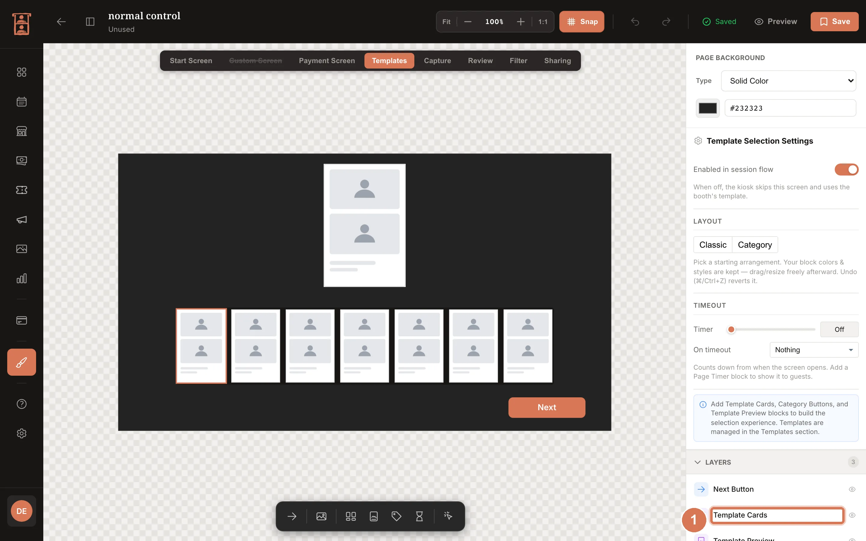
- Open the Templates tab and select the Template Cards block. It shows every template assigned to the booth, using the thumbnail rendered in the Template Editor.
- Size and place the block, and set the card shadow and corner radius (the default radius is 0). Templates with categories get a category rail that scrolls when there are many.
Step 6: Design the Capture and Review screens
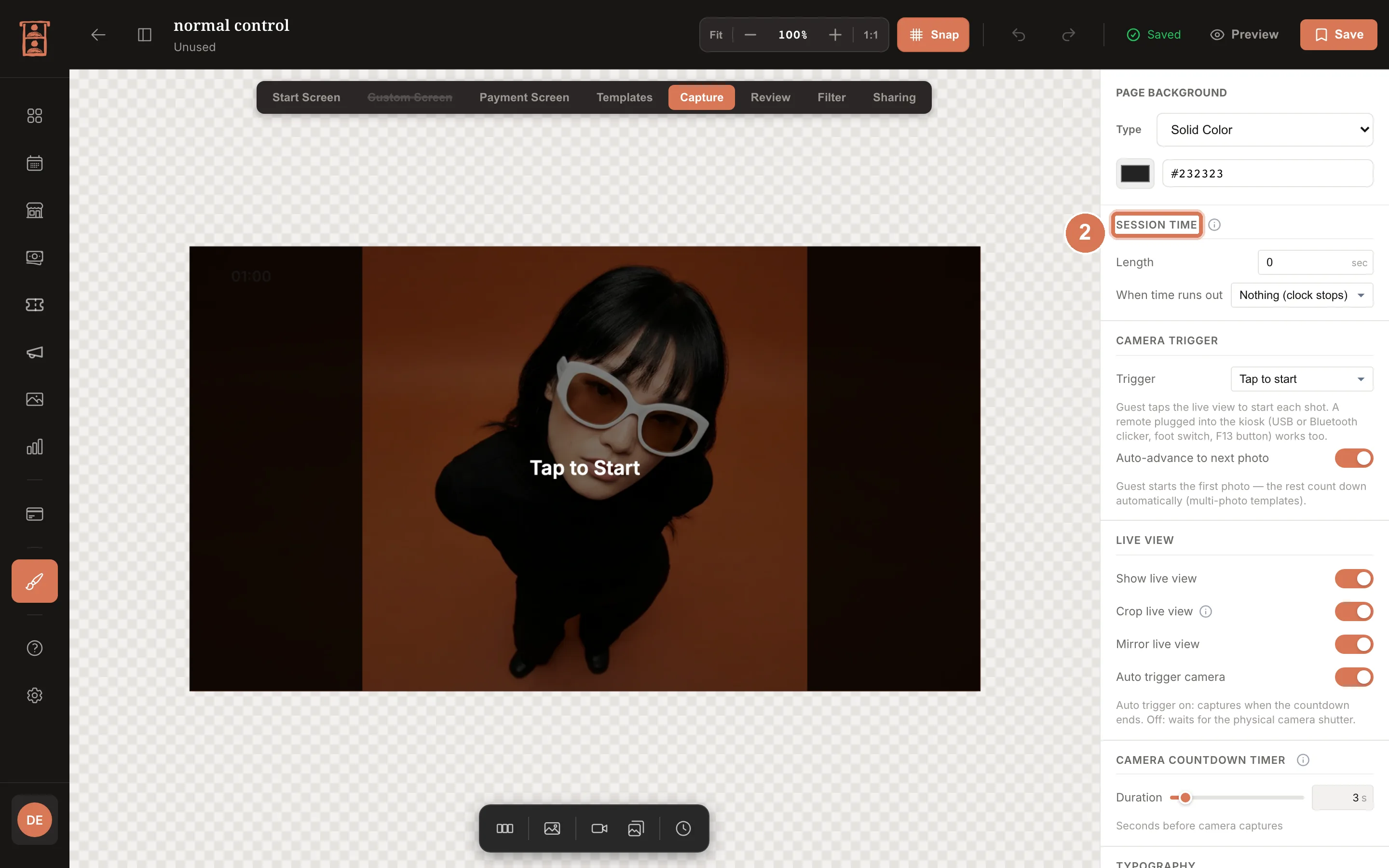
- On the Capture tab, place the Live View block where guests see themselves while they pose, and set its camera frame ratio to match your template's slots. The countdown to each shot runs on this screen.
- Set Session Time in the page settings. The countdown starts at the first capture; a Session Timer block only displays it, always as MM:SS.
- Add the Preview Cards block: one square card per template slot, numbered while empty, filled as the shots land, with the current slot ringed. A Photo Counter block shows how many shots are done.
- On the Review tab, place the Review Photo block and the Retake Button and Next Button; the built-in buttons size to their blocks. Under Review Settings, turn on Advanced mode if guests should adjust each photo: tapping a slot on the composed preview lets them scale, move and mirror that one photo.
Step 7: Design the Filter and Sharing screens
- On the Filter tab, add the Filter Strip block, a grid of filter cards, and choose its card ratio (16:9 to square; square is the default). Filter cards take their corner radius from the strip. Add a Filter Preview block so guests see the chosen filter on their photo.
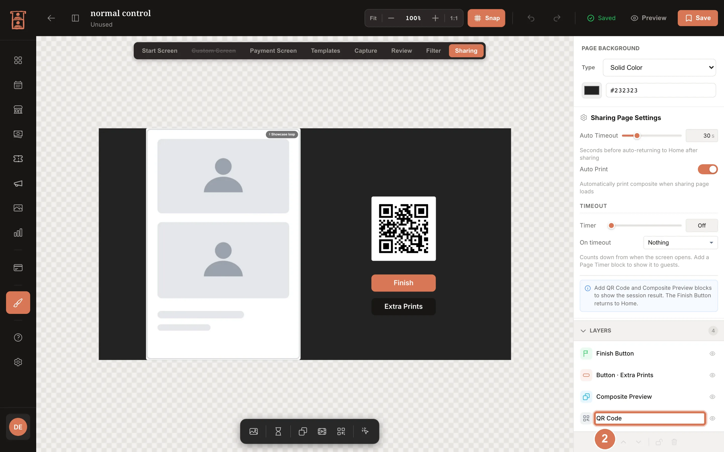
- On the Sharing tab, add the QR Code block (the link to the guest's photos), the Composed Preview block (the finished print) and a Finish Button. With the showcase loop off, the preview shows the live photo once it is ready; GIF previews show the real GIF. If you sell extra prints, the price comes from the booth's Pricing > Extra prints tab and the extra prints control appears on this screen.
Step 8: Preview, save and assign
- Click Preview to walk through the screens as a guest would, then Save.
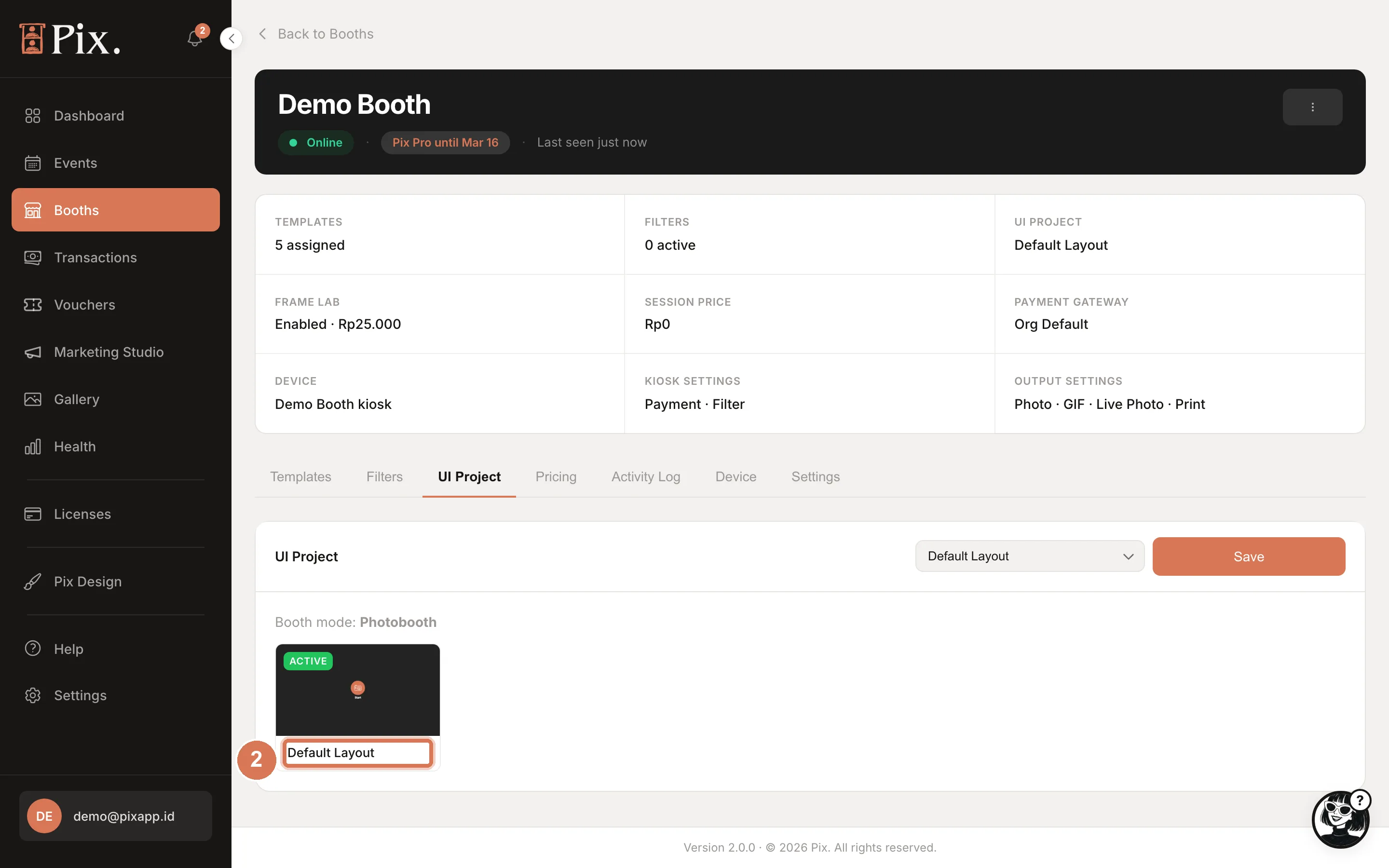
- Assign the design: on UI Projects, open the card's menu and choose Assign to booths; or open the booth's UI Project tab, pick the project from the dropdown and click Save.
The card menu also offers Duplicate (start a variant for another client), Rename, Add frame template to this project and Delete.
If a coin acceptor or card reader starts sessions by pressing F13, tick F13 as the only session trigger and turn the Payment Screen off. Any other trigger lets guests start without paying. See Connect a Coin Acceptor or Card Reader.
Check It Worked
- The project card on UI Projects shows the booth count, and the editor header reads N booths instead of Unused.
- The booth's UI Project tab shows the project and its Booth mode.
- On the booth, run a test session and walk through every screen you designed.
Troubleshooting
| Symptom | Cause | Fix |
|---|---|---|
| Save opens the Pix Pro modal | The account is on Pix Starter | Start the free trial or buy Pix Pro |
| A screen never appears on the booth | Enabled in session flow is off for that page; for the Payment Screen, Payment on this booth is off or the computer is on Pix Starter | Turn the page on; check the booth's Pricing tab |
| The booth still shows the old design | The project is not assigned to that booth | Booth > UI Project tab, pick the project, Save |
| A Studio project cannot be chosen for a booth | The booth's Pix Desktop App is older than 1.1.98 | Update the app from the operator menu (Check for Updates) |
| Guests cannot start a session | No session trigger ticked and no Start Button on the canvas | Tick Touch Screen or add a Start Button |